# Angular quick start
Mount a working diagram in Angular, then choose the right host and integration components for diagrams, kits, toolbars, and property editing.
The same headless model drives every framework binding; Angular components provide the Angular-shaped way to mount and work with it.
## Prerequisites
Use Angular 18.1 through 22. The Angular package's peer dependencies include Angular common, core, forms, and platform-browser, Grafloria engine and renderer, RxJS, and Grafloria element.
Install the Angular binding and its peer packages in your Angular project:
```bash
npm install @grafloria/angular @angular/common @angular/core @angular/forms @angular/platform-browser @grafloria/engine @grafloria/renderer rxjs @grafloria/element
```
## 1. Mount a canvas
Use [`DiagramCanvasComponent`](https://bench-grafloria-6l.atloria.app/p/bench-grafloria-6l-dqcsEdUbfS/developer/grafloria-angular-components-diagramcanvascomponent#diagramcanvascomponent) for a flow editor backed by node and edge data. Its `nodes` and `edges` model bindings round-trip edits to the arrays. [`GrafloriaNodeDefDirective`](https://bench-grafloria-6l.atloria.app/p/bench-grafloria-6l-dqcsEdUbfS/developer/grafloria-angular-core#graflorianodedefdirective) marks a template for nodes of a matching type. The sample includes real data, gives the canvas a height, and turns on the shipped minimap, zoom and fit controls, and background grid.
```ts
import { Component } from '@angular/core';
import { DiagramCanvasComponent, GrafloriaNodeDefDirective } from '@grafloria/angular';
import type { EdgeSpec, NodeSpec } from '@grafloria/renderer';
@Component({
selector: 'app-root',
standalone: true,
imports: [DiagramCanvasComponent, GrafloriaNodeDefDirective],
template: `
{{ data['title'] }}
{{ data['owner'] }}
`,
styles: [
`.job-card {
box-sizing: border-box;
height: 100%;
padding: 12px;
border: 1px solid #94a3b8;
border-radius: 8px;
background: white;
display: grid;
align-content: center;
gap: 6px;
}`,
],
})
export class AppComponent {
nodes: NodeSpec[] = [
{
id: 'extract',
type: 'job',
position: { x: 60, y: 90 },
size: { width: 180, height: 84 },
data: { title: 'Extract', owner: 'Data team' },
},
{
id: 'publish',
type: 'job',
position: { x: 340, y: 90 },
size: { width: 180, height: 84 },
data: { title: 'Publish', owner: 'Platform team' },
},
];
edges: EdgeSpec[] = [
{ id: 'extract-publish', source: 'extract', target: 'publish' },
];
}
```
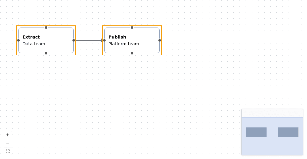
The canvas shows two Angular-rendered job cards connected by an edge, plus its plugin controls and grid. A matching `grafloriaNode` template is the integration: the canvas routes nodes of that type through Angular's template rendering without a separate node registry.
## 2. Choose a kit host for a data-first diagram
Use [`GrafloriaDiagramComponent`](https://bench-grafloria-6l.atloria.app/p/bench-grafloria-6l-dqcsEdUbfS/developer/grafloria-angular-components-classes#grafloriadiagramcomponent) when a kit builds a complete diagram from a spec. Here `erDiagram` supplies the entity and relationship data, and `` mounts the resulting kit spec. The host also accepts UML and other kit specs through the same `spec` input.
```ts
import { Component } from '@angular/core';
import { GrafloriaDiagramComponent } from '@grafloria/angular';
import { erDiagram } from '@grafloria/element';
@Component({
selector: 'app-entity-diagram',
standalone: true,
imports: [GrafloriaDiagramComponent],
template: `
`,
})
export class EntityDiagramComponent {
spec = erDiagram({
entities: [
{
id: 'CUSTOMER',
name: 'Customer',
position: { x: 60, y: 80 },
columns: [
{ name: 'id', type: 'int', pk: true },
{ name: 'name', type: 'varchar' },
],
},
{
id: 'ORDER',
name: 'Order',
position: { x: 360, y: 80 },
columns: [
{ name: 'id', type: 'int', pk: true },
{ name: 'customer_id', type: 'int', fk: true },
],
},
],
relationships: [{ from: 'CUSTOMER', to: 'ORDER', label: 'places' }],
});
}
```
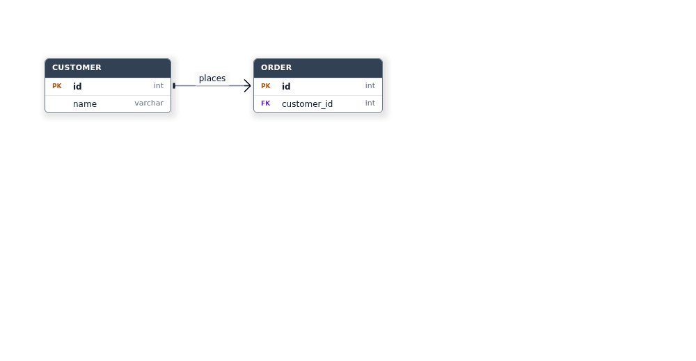
The mounted kit renders two entity tables joined by a relationship. For a dashboard kit, [`GrafloriaDashboardComponent`](https://bench-grafloria-6l.atloria.app/p/bench-grafloria-6l-dqcsEdUbfS/developer/grafloria-angular-components-grafloriadashboardcomponent#grafloriadashboardcomponent) is the data-first host; its widget templates use [`GrafloriaWidgetDefDirective`](https://bench-grafloria-6l.atloria.app/p/bench-grafloria-6l-dqcsEdUbfS/developer/grafloria-angular-components-classes#grafloriawidgetdefdirective).
## 3. Find the Angular integrations
These components connect the canvas to custom Angular UI or add editing controls around it. The canvas already mounts its link toolbar when a link is hovered or selected; use the component directly when you need to place that toolbar in your own host.
| Need | Component | What it provides |
|---|---|---|
| Render a node with Angular markup | `GrafloriaNodeDefDirective` | An `ng-template[grafloriaNode]` matched by node type. Its context exposes the live node and its `data` payload. |
| Make an HTML node element a connection endpoint | [`GrafloriaHandleDirective`](https://bench-grafloria-6l.atloria.app/p/bench-grafloria-6l-dqcsEdUbfS/developer/grafloria-angular-core#grafloriahandledirective) | The `grafloriaHandle` attribute marks a source or target inside an HTML node; the parent node element needs a `data-node-id`. |
| Add contextual actions for a node | [`NodeToolbarComponent`](https://bench-grafloria-6l.atloria.app/p/bench-grafloria-6l-dqcsEdUbfS/developer/grafloria-angular-components-nodetoolbarcomponent#nodetoolbarcomponent) | A floating node toolbar positioned relative to the supplied node. Bind its node and engine. |
| Edit selected node properties | [`PropertyPanelComponent`](https://bench-grafloria-6l.atloria.app/p/bench-grafloria-6l-dqcsEdUbfS/developer/grafloria-angular-components-propertypanelcomponent#propertypanelcomponent) | A schema-driven property editor. Set its `selectedNodes` property on the component instance; the panel needs a property schema for the node type. Its default update mode applies valid changes immediately; deferred mode provides Save and Cancel actions. |
These are integrations around the canvas, not alternate diagram hosts. The canvas owns drawing and interaction; custom-node templates add Angular-rendered node content, while toolbars and the property panel provide companion UI. The following standalone examples show each companion component in a mounted Angular view.
### Add a node toolbar
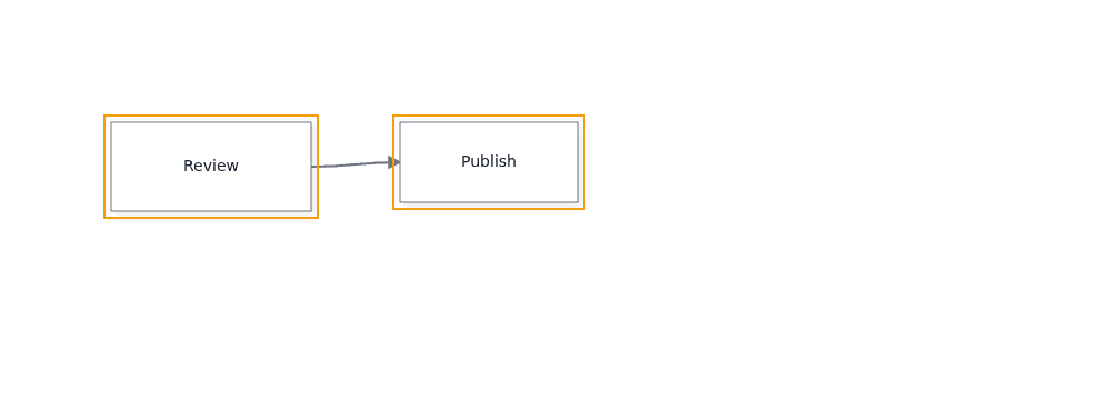
Pass the selected live node and the canvas engine to the node toolbar. Set [`NodeToolbarConfig`](https://bench-grafloria-6l.atloria.app/p/bench-grafloria-6l-dqcsEdUbfS/developer/grafloria-angular-components-interfaces#nodetoolbarconfig) to keep the toolbar visible without requiring a selection. This sample uses a [`ToolbarAction`](https://bench-grafloria-6l.atloria.app/p/bench-grafloria-6l-dqcsEdUbfS/developer/grafloria-angular-components-interfaces#toolbaraction) to place an Inspect action beside the first node; selecting it writes that node's ID to the browser console.
```ts
import { Component } from '@angular/core';
import { DiagramCanvasComponent, NodeToolbarComponent } from '@grafloria/angular';
import type { NodeToolbarConfig, ToolbarAction } from '@grafloria/angular';
import type { EdgeSpec, NodeSpec } from '@grafloria/renderer';
@Component({
selector: 'app-node-actions',
standalone: true,
imports: [DiagramCanvasComponent, NodeToolbarComponent],
template: `
@if (canvas.activeEngine(); as engine) {
@if (engine.getDiagram()?.getNode('job'); as node) {
}
}
`,
})
export class NodeActionsComponent {
nodes: NodeSpec[] = [
{ id: 'job', type: 'task', position: { x: 100, y: 110 }, size: { width: 180, height: 80 }, label: 'Review' },
{ id: 'next', position: { x: 360, y: 110 }, size: { width: 160, height: 72 }, label: 'Publish' },
];
edges: EdgeSpec[] = [{ id: 'job-next', source: 'job', target: 'next' }];
toolbarConfig: NodeToolbarConfig = { behavior: { hideOnMultiSelect: false } };
actions: ToolbarAction[] = [
{ id: 'inspect', label: 'Inspect', onClick: node => console.info(node.id) },
];
}
```
### Add a link toolbar
The canvas normally supplies link actions itself. Mount [`LinkToolbarComponent`](https://bench-grafloria-6l.atloria.app/p/bench-grafloria-6l-dqcsEdUbfS/developer/grafloria-angular-components-linktoolbarcomponent#linktoolbarcomponent) directly when you want a separate toolbar host; this example attaches an Inspect action described by [`LinkToolbarAction`](https://bench-grafloria-6l.atloria.app/p/bench-grafloria-6l-dqcsEdUbfS/developer/grafloria-angular-components-interfaces#linktoolbaraction) to the live link in a mounted canvas.
```ts
import { Component } from '@angular/core';
import { DiagramCanvasComponent, LinkToolbarComponent } from '@grafloria/angular';
import type { LinkToolbarAction } from '@grafloria/angular';
import type { EdgeSpec, NodeSpec } from '@grafloria/renderer';
@Component({
selector: 'app-link-actions',
standalone: true,
imports: [DiagramCanvasComponent, LinkToolbarComponent],
template: `
@if (canvas.activeEngine(); as engine) {
@if (engine.getDiagram()?.getLink('flow'); as link) {
}
}
`,
})
export class LinkActionsComponent {
nodes: NodeSpec[] = [
{ id: 'start', position: { x: 70, y: 120 }, size: { width: 150, height: 70 }, label: 'Start' },
{ id: 'finish', position: { x: 350, y: 120 }, size: { width: 150, height: 70 }, label: 'Finish' },
];
edges: EdgeSpec[] = [{ id: 'flow', source: 'start', target: 'finish' }];
actions: LinkToolbarAction[] = [
{ id: 'inspect', label: 'Inspect link', onClick: context => console.info(context.link.id) },
];
}
```
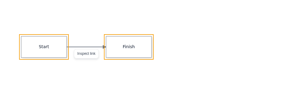
The live link supplies the toolbar's position and its action context. The Inspect button logs the connected link's ID when clicked.
### Add a property panel
The property panel needs a schema for the selected node type. Register one with [`PropertyPanelService`](https://bench-grafloria-6l.atloria.app/p/bench-grafloria-6l-dqcsEdUbfS/developer/grafloria-angular-services-propertypanelservice#propertypanelservice) before displaying the panel; assign a [`PropertyDiagramNode`](https://bench-grafloria-6l.atloria.app/p/bench-grafloria-6l-dqcsEdUbfS/developer/grafloria-angular-services#propertydiagramnode) to the component instance's `selectedNodes` property and define its fields with [`PropertySchema`](https://bench-grafloria-6l.atloria.app/p/bench-grafloria-6l-dqcsEdUbfS/developer/grafloria-renderer-types-propertyschema#propertyschema). Its string editor changes the selected node's data immediately.
```ts
import { AfterViewInit, Component, viewChild } from '@angular/core';
import { PropertyPanelComponent, PropertyPanelService } from '@grafloria/angular';
import type { PropertyDiagramNode } from '@grafloria/angular';
import type { PropertySchema } from '@grafloria/renderer';
@Component({
selector: 'app-properties',
standalone: true,
imports: [PropertyPanelComponent],
template: `
Current title: {{ selectedNodes.data['title'] }}
`,
})
export class PropertiesComponent implements AfterViewInit {
panel = viewChild.required(PropertyPanelComponent);
selectedNodes: PropertyDiagramNode = {
id: 'job',
type: 'quick-start-task',
label: 'Review',
data: { title: 'Review' },
};
constructor(propertyPanel: PropertyPanelService) {
if (!propertyPanel.getSchema('quick-start-task')) {
const schema: PropertySchema = {
properties: [{ key: 'title', label: 'Title', editor: 'string' }],
};
propertyPanel.registerSchema('quick-start-task', schema);
}
}
ngAfterViewInit(): void {
this.panel().selectedNodes = this.selectedNodes;
}
onPropertyChanged(property: string, value: unknown): void {
console.info(`${property}: ${String(value)}`);
}
}
```

The panel renders a Title editor for the selected node. Editing the field changes its `data.title` value, which the line below the panel reflects.
### Add an interaction settings panel
[`InteractionConfigPanelComponent`](https://bench-grafloria-6l.atloria.app/p/bench-grafloria-6l-dqcsEdUbfS/developer/grafloria-angular-components-interactionconfigpanelcomponent#interactionconfigpanelcomponent) needs the live canvas engine. Guard the panel with Angular's `@if` so it mounts after the canvas provides that engine.
```ts
import { Component } from '@angular/core';
import { DiagramCanvasComponent, InteractionConfigPanelComponent } from '@grafloria/angular';
import type { NodeSpec } from '@grafloria/renderer';
@Component({
selector: 'app-interaction-settings',
standalone: true,
imports: [DiagramCanvasComponent, InteractionConfigPanelComponent],
template: `
@if (canvas.activeEngine(); as engine) {
}
`,
})
export class InteractionSettingsComponent {
nodes: NodeSpec[] = [
{ id: 'task', position: { x: 80, y: 90 }, size: { width: 160, height: 72 }, label: 'Task' },
];
onConfigChanged(config: object): void {
console.info('Interaction settings changed', config);
}
}
```
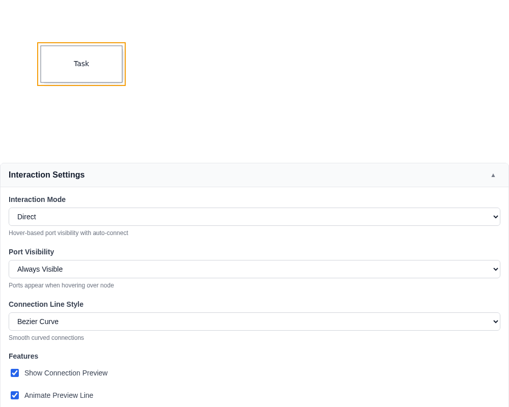
The expanded settings panel reads and updates interaction configuration on the same engine that drives the visible node.
### Show comment threads
[`GrafloriaCommentPanelComponent`](https://bench-grafloria-6l.atloria.app/p/bench-grafloria-6l-dqcsEdUbfS/developer/grafloria-angular-components-classes#grafloriacommentpanelcomponent) uses the comment store created by the canvas. This sample mounts the conversation panel beside a canvas with comments enabled.
```ts
import { AfterViewInit, Component, viewChild } from '@angular/core';
import { DiagramCanvasComponent, GrafloriaCommentPanelComponent } from '@grafloria/angular';
import type { NodeSpec } from '@grafloria/renderer';
@Component({
selector: 'app-comments',
standalone: true,
imports: [DiagramCanvasComponent, GrafloriaCommentPanelComponent],
template: `
@if (canvas.getCommentStore(); as store) {
}
`,
})
export class CommentsComponent implements AfterViewInit {
canvas = viewChild.required(DiagramCanvasComponent);
nodes: NodeSpec[] = [
{ id: 'note', position: { x: 80, y: 90 }, size: { width: 160, height: 72 }, label: 'Discuss this step' },
];
ngAfterViewInit(): void {
this.canvas().getCommentStore()?.createThread(
{ kind: 'node', id: 'note' },
'Should this step include an approval?'
);
}
}
```
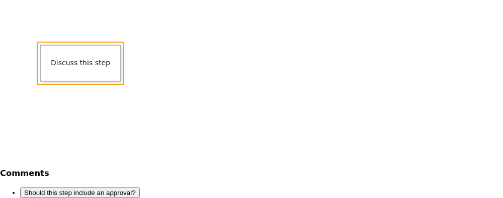
The comment panel receives the canvas's live store and shows the seeded thread anchored to the node.
### Identify the lower-level canvas package
[`CanvasNgCanvasNgComponent`](https://bench-grafloria-6l.atloria.app/p/bench-grafloria-6l-dqcsEdUbfS/developer/grafloria-canvas-ng#canvasngcanvasngcomponent) belongs to the separate `@grafloria/canvas-ng` package. It has no inputs or outputs and is not the diagram canvas above; this sample mounts that package's component as-is.
Install that optional package before using this sample:
```bash
npm install @grafloria/canvas-ng
```
```ts
import { Component } from '@angular/core';
import { CanvasNgCanvasNgComponent } from '@grafloria/canvas-ng';
@Component({
selector: 'app-canvas-ng',
standalone: true,
imports: [CanvasNgCanvasNgComponent],
template: ``,
})
export class CanvasNgExampleComponent {}
```

This component renders its own package placeholder; use `DiagramCanvasComponent` to mount a Grafloria diagram.
## What you have
You can mount a controlled canvas with typed node and edge data, render custom nodes as Angular templates, and choose the generic kit host when a kit provides the diagram spec. The component map shows which separate integrations add node connections, contextual actions, and property editing.
## Where to go next
- [Create custom nodes](https://bench-grafloria-6l.atloria.app/p/bench-grafloria-6l-dqcsEdUbfS/developer/create-custom-nodes) to build out template-rendered nodes.
- [Build ER and UML diagrams](https://bench-grafloria-6l.atloria.app/p/bench-grafloria-6l-dqcsEdUbfS/developer/build-er-and-uml-diagrams) for the data-first kit hosts.
- [Build dashboards](https://bench-grafloria-6l.atloria.app/p/bench-grafloria-6l-dqcsEdUbfS/developer/build-dashboards) for dashboard views and widget templates.
- Explore the [Angular tutorial](https://grafloria.com/learn/angular/) and the [Angular demo gallery](https://grafloria.com/demos-angular/) for live examples.