# React quick start
Build a working diagram in React, connect sibling UI to its live instance, and render kit diagrams and comment threads.
One headless model drives every framework binding: the React components are framework-specific skins over the same diagram engine.
## Prerequisites
Use a browser-based React app with React and React DOM 17, 18, or 19. The `@grafloria/react` 0.10.6 package declares peers `@grafloria/engine` `^0.3.0`, `@grafloria/renderer` `^0.4.16`, and `@grafloria/element` `^0.4.3`.
Install the binding and its peers:
```bash
npm install @grafloria/react @grafloria/engine @grafloria/renderer @grafloria/element react react-dom
```
## 1. Mount a flow
Use [`GrafloriaFlow`](https://bench-grafloria-6l.atloria.app/p/bench-grafloria-6l-dqcsEdUbfS/developer/grafloria-react#grafloriaflow) for an interactive node-and-edge canvas. The starter data uses [`NodeSpec`](https://bench-grafloria-6l.atloria.app/p/bench-grafloria-6l-dqcsEdUbfS/developer/grafloria-renderer-instance-nodespec#nodespec) and [`EdgeSpec`](https://bench-grafloria-6l.atloria.app/p/bench-grafloria-6l-dqcsEdUbfS/developer/grafloria-renderer-instance-edgespec#edgespec); `defaultNodes` and `defaultEdges` seed an uncontrolled diagram, which the instance owns after mount.
```tsx
import { GrafloriaFlow } from '@grafloria/react';
import type { EdgeSpec, NodeSpec } from '@grafloria/renderer';
const nodes: NodeSpec[] = [
{ id: 'ingest', position: { x: 60, y: 80 }, size: { width: 180, height: 80 }, data: { label: 'Ingest' } },
{ id: 'publish', position: { x: 380, y: 80 }, size: { width: 180, height: 80 }, data: { label: 'Publish' } },
];
const edges: EdgeSpec[] = [{ id: 'e1', source: 'ingest', target: 'publish' }];
export default function App() {
return (
);
}
```
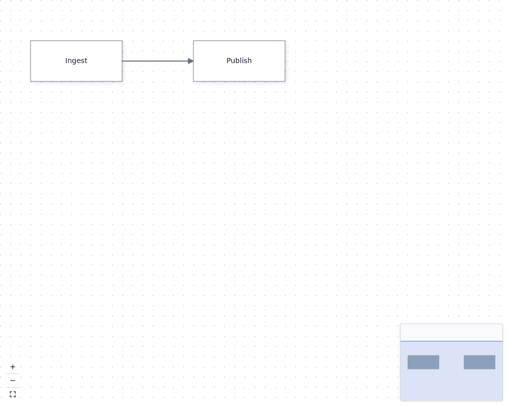
The mounted canvas shows Ingest connected to Publish, with the minimap, zoom and fit controls, and background supplied by `plugins`. Give the wrapper a resolved height; the canvas fills its parent.
## 2. Keep controlled data in React state
When application UI owns the graph, [`useNodesState`](https://bench-grafloria-6l.atloria.app/p/bench-grafloria-6l-dqcsEdUbfS/developer/grafloria-react#usenodesstate) and [`useEdgesState`](https://bench-grafloria-6l.atloria.app/p/bench-grafloria-6l-dqcsEdUbfS/developer/grafloria-react#useedgesstate) provide state plus a separate callback for changes coming back from the canvas. Keep both callback connections: without `onNodesChange`, for example, a node drag can be overwritten by stale controlled state on the next render.
```tsx
import { GrafloriaFlow, useEdgesState, useNodesState } from '@grafloria/react';
import type { EdgeSpec, NodeSpec } from '@grafloria/renderer';
const initialNodes: NodeSpec[] = [
{ id: 'ingest', position: { x: 60, y: 80 }, size: { width: 180, height: 80 }, label: 'Ingest' },
{ id: 'publish', position: { x: 380, y: 80 }, size: { width: 180, height: 80 }, label: 'Publish' },
];
const initialEdges: EdgeSpec[] = [{ id: 'e1', source: 'ingest', target: 'publish' }];
export default function ControlledFlow() {
const [nodes, setNodes, onNodesChange] = useNodesState(initialNodes);
const [edges, , onEdgesChange] = useEdgesState(initialEdges);
return (
);
}
```
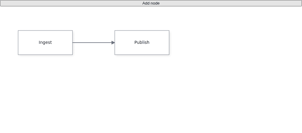
The button adds a node to React state, and dragging or deleting nodes and edges sends the resulting models back through the third tuple values. The second tuple value updates React's specs; it is not the canvas change callback.
## 3. Reach the canvas from sibling UI
Wrap a toolbar and canvas in [`GrafloriaProvider`](https://bench-grafloria-6l.atloria.app/p/bench-grafloria-6l-dqcsEdUbfS/developer/grafloria-react#grafloriaprovider) when the toolbar is outside the flow subtree. [`useGrafloria`](https://bench-grafloria-6l.atloria.app/p/bench-grafloria-6l-dqcsEdUbfS/developer/grafloria-react#usegrafloria) returns the live [`DiagramInstance`](https://bench-grafloria-6l.atloria.app/p/bench-grafloria-6l-dqcsEdUbfS/developer/grafloria-renderer-instance-diagraminstance#diagraminstance), or `null` until the flow mounts. The toolbar below calls `fitView()` on that instance.
For live readouts, [`useSelection`](https://bench-grafloria-6l.atloria.app/p/bench-grafloria-6l-dqcsEdUbfS/developer/grafloria-react#useselection) returns the current selection as state, [`useOnSelectionChange`](https://bench-grafloria-6l.atloria.app/p/bench-grafloria-6l-dqcsEdUbfS/developer/grafloria-react#useonselectionchange) runs a callback when it changes, and [`useViewport`](https://bench-grafloria-6l.atloria.app/p/bench-grafloria-6l-dqcsEdUbfS/developer/grafloria-react#useviewport) returns the camera state. [`useGrafloriaStore`](https://bench-grafloria-6l.atloria.app/p/bench-grafloria-6l-dqcsEdUbfS/developer/grafloria-react#usegrafloriastore) exposes the nearest store itself; use it when you need the store rather than only its instance.
```tsx
import { useState } from 'react';
import {
GrafloriaFlow,
GrafloriaProvider,
useGrafloria,
useGrafloriaStore,
useOnSelectionChange,
useSelection,
useViewport,
} from '@grafloria/react';
import type { EdgeSpec, NodeSpec } from '@grafloria/renderer';
const nodes: NodeSpec[] = [
{ id: 'draft', position: { x: 40, y: 80 }, label: 'Draft' },
{ id: 'review', position: { x: 280, y: 80 }, label: 'Review' },
];
const edges: EdgeSpec[] = [{ id: 'e1', source: 'draft', target: 'review' }];
function Toolbar() {
const instance = useGrafloria();
return (
);
}
function CanvasReadout() {
const store = useGrafloriaStore();
const instance = useGrafloria();
const { nodes: selectedNodes } = useSelection();
const { zoom } = useViewport();
const [selectionEvents, setSelectionEvents] = useState(0);
useOnSelectionChange(() => setSelectionEvents((count) => count + 1));
const storeConnected = instance !== null && store?.get() === instance;
return (
);
}
export default function App() {
return (
);
}
```
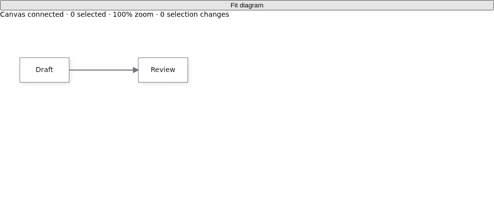
The toolbar is a sibling of the canvas, and Fit diagram frames its nodes when clicked. The readout shows the selected-node count and zoom; selecting a node updates the count and selection-change total. A single flow can also publish its instance to its own children without a provider; use the provider for components outside that subtree.
## 4. Render a kit diagram
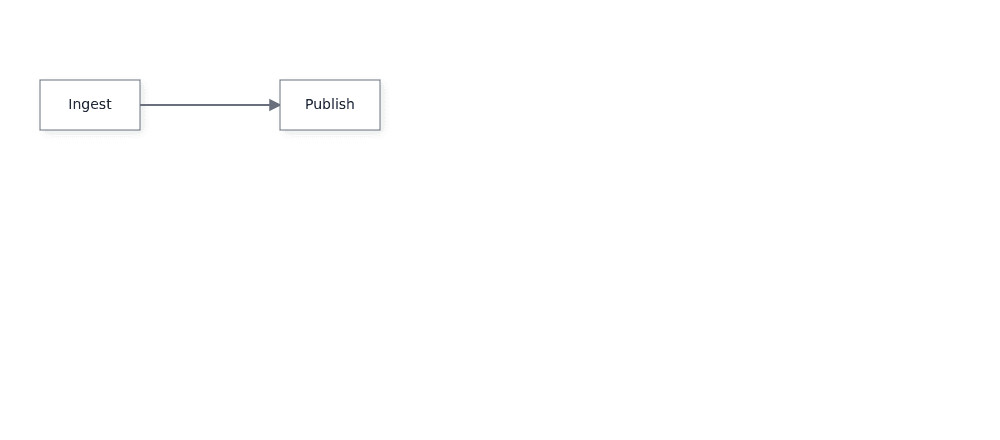
Use [`GrafloriaDiagram`](https://bench-grafloria-6l.atloria.app/p/bench-grafloria-6l-dqcsEdUbfS/developer/grafloria-react#grafloriadiagram) when you have a diagram spec rather than node and edge props. This example passes a JSON-encoded spec string; the mounted component renders a connected Ingest-to-Publish diagram.
```tsx
import { GrafloriaDiagram } from '@grafloria/react';
const spec = JSON.stringify({
nodes: [
{ id: 'ingest', position: { x: 40, y: 80 }, data: { label: 'Ingest' } },
{ id: 'publish', position: { x: 280, y: 80 }, data: { label: 'Publish' } },
],
edges: [{ id: 'e1', source: 'ingest', target: 'publish' }],
});
export default function KitDiagram() {
return (
);
}
```
## 5. Add a comment panel
Set `comments` on the flow to enable its comment store, then pass that store to [`GrafloriaCommentPanel`](https://bench-grafloria-6l.atloria.app/p/bench-grafloria-6l-dqcsEdUbfS/developer/grafloria-react#grafloriacommentpanel). [`CommentStore`](https://bench-grafloria-6l.atloria.app/p/bench-grafloria-6l-dqcsEdUbfS/developer/grafloria-engine-comments-commentstore#commentstore) is available from the instance after mount; this example anchors a starter thread to the Review node.
```tsx
import { useState } from 'react';
import { GrafloriaCommentPanel, GrafloriaFlow } from '@grafloria/react';
import type { CommentStore } from '@grafloria/engine';
import type { EdgeSpec, NodeSpec } from '@grafloria/renderer';
const nodes: NodeSpec[] = [
{ id: 'design', position: { x: 40, y: 100 }, size: { width: 150, height: 66 }, label: 'Design' },
{ id: 'review', position: { x: 260, y: 100 }, size: { width: 150, height: 66 }, label: 'Review' },
];
const edges: EdgeSpec[] = [{ id: 'e1', source: 'design', target: 'review' }];
export default function FlowWithComments() {
const [store, setStore] = useState(null);
return (
{
const commentStore = instance.getCommentStore();
if (commentStore) {
commentStore.createThread(
{ kind: 'node', id: 'review' },
'Can we tighten the review step?'
);
setStore(commentStore);
}
}}
/>
{store && (
)}
);
}
```
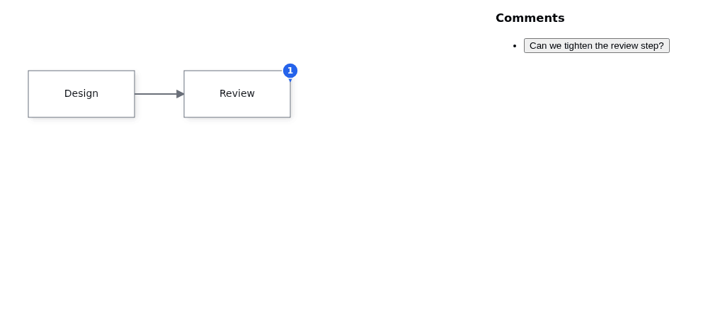
The canvas renders Design and Review with their edge, and the panel appears beside it with a thread attached to Review. The panel follows the store passed at mount; this example keeps that store in React state until the component unmounts.
## What you have
You now have an interactive React canvas, controlled state that stays synchronized with edits, sibling UI that reaches the canvas instance, a generic kit-diagram host, and a comment panel bound to the canvas store.
## Where next
- [Every demo as a React component](https://grafloria.com/demos-react/) — see the live React examples.
- [How Grafloria works](https://bench-grafloria-6l.atloria.app/p/bench-grafloria-6l-dqcsEdUbfS/developer/how-grafloria-works) — the model and engine ideas behind the bindings.
- [The instance and data flow](https://bench-grafloria-6l.atloria.app/p/bench-grafloria-6l-dqcsEdUbfS/developer/instance-and-data-flow) — follow data between React and the live diagram.
- [Custom nodes in React](https://grafloria.com/learn/react-custom-nodes/) — render React components for node types.